
Tuesday, November 14, 2017
Supervised Image Classification
This week we worked on Lab 10 which allowed us to create spectral signatures and AOI features. We were able to produce classified images from satellite data given. We were able to recognize and eliminate spectral confusion between spectral signatures. The map shown is a Land Use map of Germantown Maryland. The different color indicate different land uses, we had to create the SIG file from an Image file in order to be able to classify the different land uses.

Tuesday, November 7, 2017
Unsupervised Classification Lab9
This week we worked in ERDAS to label features in an image under categories. We were able to take the image of the UWF campus and classify it.
The map below is a map that shows the UWF campus. The colors in the legend signify the different land features of the image.
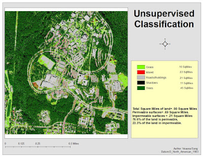
The map below is a map that shows the UWF campus. The colors in the legend signify the different land features of the image.
Wednesday, November 1, 2017
Thermal & Multispectral Analysis, Lab8 4035
This week we got to toy with Composite bands in Arcmap, and Layers Stacks in ERDAS. In my map I chose to show the fires in Florida. I chose this image for the fires would show better thermally in comparison to the land, for me to get the image to where I wanted it, I stretched the image and chose band 6, then I color ramped the image from red to blue, then I adjusted the DN value in the Histograms, to 14 and 40. The blue color in the image shows the cooler objects, and the yellow and red images are the objects that are thermally hotter.


Tuesday, October 24, 2017
Spatial Enhancement, 4035 Photographic interpretation and Remote Sensing
This week we focused on Multispectral Analysis. Multispectral Analysis dealt with image enhancing ,adjusting breakpoints and LUT Histogram, we learned how to select different layers in the panchromatic tab to adjust our image so we can enhance the image to show different features.
In the first map we had to chose an area where in Layer 4 it had the spike range of 12 and 18. I noticed that in Layer 4 the area that had the change was the water. So I chose an image of the water for Feature 1.


In the first map we had to chose an area where in Layer 4 it had the spike range of 12 and 18. I noticed that in Layer 4 the area that had the change was the water. So I chose an image of the water for Feature 1.

For my second map they lab wanted us to identify a feature that both represented a small spike value in Layer 1-4, but a large spike pixel value in Layers 5 and 6. In the map I chose to show the mountain range for in Layers 1-4 the features were bright, and in Layers 5-6 the features were dark.

Map three shows the image of an area of water that in Layer 1-3 was brighter than normal, but in Layer 4 become somewhat brighter, and in Layers 5-6 remain unchanged. In the map I chose to show an image of Lake Tapps for my 3rd feature.

Tuesday, October 17, 2017
Spatial Enhancements,
This week we were able to familiarize ourselves with Glovis at the USGS website. We were able to download Landsat images from USGS's archive. We also got to convert TIFFs and filter them through different filters. In Arcmap we were able tp filter imaged using Focal Statistical Analysts. In ERDAS we were able to convert Striping image into a visible map image.
 In the image above it shows the outcome of a striping image once it has been converted into a visible image. After the image was converted it was enhanced in Arcmap using the focal spatial analysts.

Tuesday, October 3, 2017
Intro to ERDAS Image and Digital Data 1
This weeks lab we learned a few calculations such as Maxwell's wave theory, and Planck's relation,both which are needed when calculating EMRs. We also got to learn and use a new system called ERDAS. ERDAS is a beginning processing step for making Arc maps.
The Arc map displayed was made from data created on ERDAS. The picture was then used to create this map in Arc map. The map represented different terrain types, and the square acres of that terrain,within the Olympic Mountains, located in Seattle, Washington.

The Arc map displayed was made from data created on ERDAS. The picture was then used to create this map in Arc map. The map represented different terrain types, and the square acres of that terrain,within the Olympic Mountains, located in Seattle, Washington.

Tuesday, September 26, 2017
Truthing Lab4
I started the Truthing lab with my previous lab3 arcmap. In this lab I randomly placed 30 points on my existing LULC arcmap. The lab allowed us to compare the over all land code to the actual land usage of the points. The points on the map signifies if the land use and land codes on the map match the land usage of the actual point.


Sunday, September 17, 2017
Land Use Land Cover
Land Use Land Coverage was about taking the picture given and deciding which land attributes of the picture were to be categorized. In this lab I was able to create a shapefile and place different land features of the map under different Code Descriptions.
The Map to the right represent different land uses. Each number placed on the map is in relation with the colors on the legend which describes the land usage.

The Map to the right represent different land uses. Each number placed on the map is in relation with the colors on the legend which describes the land usage.

Wednesday, September 6, 2017
GIS4035/4035L Lab2
Lab-2 exercise 1 consisted of taking an aerial photograph and marking individual areas of the photo and categorizing the area depending on its physical features. We had to mark the photo on tone color, and texture.


Lab 2 exercise 2 was based on the same principle as marking up the photograph, but his time the focus was more on the shapes, patterns, and shadows of the objects. In the picture below we had to mark the objects and place them in the three categories.

Saturday, April 29, 2017
WK14 Bobwhite Manatee Transmission Line
Week 14 lab finals we were given the task to run GIS Arcmap analysis for the Bobwhite Manatee Transmission Line. The projected consisted of filtering data for land sensitive areas, displaying land parcels and residential homes that would be affected by the transmission line. In the map below it displays all the residential homes within the preferred corridor and the 400ft preferred corridor buffer zone. This is just one of the maps that i generated for the project.
The mapped displayed is a map showing the homes that are affected by the transmission line. The residential homes displayed are those that are within the preferred corridor and those that are within the 400ft buffer zone.
Students.uwf.edu/ve8/intro2GIS/Final_project/Final_project.pptx
Students.uwf.edu/ve8/intro2GIS/Final_project/Wk14_Finals_Transcript.pdf
Wednesday, April 5, 2017
WK13 Georeferencing
In the first map there are two data frames. The first data frame is of the UWF campus with an inset map of Escambia County, FLorida signifying the location of the Campus.


The second map shows a 3D rendition of the campus.

Wednesday, March 29, 2017
Wk12 Geocoding
In week 12 the lab focused on creating address locators, conducting
geocodes to match the addresses, we learned how to fix geocoding problems, and we created a route analysis. The lab also included much
of the previous labs .
The map I generated shows two data
frames. Frame 1 shows an outline of Lake County, Florida with the EMS locations
included. In Frame 2 it shows a zoomed view of the optimal route for the three
specified EMS location that I have chosen.


Monday, March 27, 2017
WK10 Vector2
In lab 10 we learned how to set buffers on layer data, unify layers, and erase layers. We learned how to utilize Arcpy and run analysis with script, also learned how to select data depending on the integer placed in the field column. The map I created shows a map of possible campsites with conservation areas in the Desoto Mississippi. In the map I placed a 100 meter buffer for the conservation areas, and deleted that buffer from the surrounding campsite. This gave the campsites a 100 meter cushion between them and the conservation area.


Wednesday, March 8, 2017
Calhoun County Florida
I was assigned to create an Arcmap of Calhoun County Florida. At a glance the lab appeared to be something that I did not want any part of, but as the lab progressed I began to better understand what was needed to accomplish this lab. I actually found the lab enjoyable in the end. The only part that I did not like was having to search through the many files in order to get the correct data to fit what one was trying to show. I learned a lot in this lab, not only did this lab use the teachings of the previous labs, but it also taught me other methods of manipulating physical features of the projected data. With this lab we familiarized ourselves with FGDL, Labins, and NationalMap.gov. I also learned how to search and download the correct data needed for ArcMaps.
The ArcMap I created actually consist of two maps, the Map on the left is a basic map layout showing the major roads, cities, major rivers, parks, invasive plants of Calhoun County. The map to the right is a map that shows the hydrology, elevations, land cover, and the DOQQ of Calhoun County Florida.


Thursday, February 23, 2017
Wk6_Projections2
In this weeks lab we were able to learn how to download specific DRG, and aerial images from such web based sites like Labins.org, FGDL.org. Once the files were downloaded we were able to manipulate what reference properties in which projected the images on to the map. We also learned how to turn GSP degree coordinates into decimals which in turn can be used as data, and then be used to locate things in the map. The map shown below is a map showing the petroleum storage locations in Walnut Hill in Escambia County. The dots signify the location of the storage tanks.


Thursday, February 16, 2017
WK5 Projecitons Prt1

The map I created shows the counties of Florida, within the map there are selected counties that were highlighted for the lab. Each map referenced a different coordinate system. The legends incorporated in each map shows the selected counties and their names. The chart below the maps indicate the Square mileage of each selected county and shows the differences in data from each system.
Thursday, February 9, 2017
WK4_SharingGIS

On cold days like this, there is nothing that keeps me warm besides a nice Lab from GIS. This week we learned how to create map packages, create maps for the web, and created a KML file to share in google earth.
At first I found creating the data for the map package the most troublesome. I had problems getting my text file to load up into ArcGIS Online to get the geocode for my map package. After the geocode was created we were able to bring the shape file into ArcMap.
The map shown to the right is an actual web map that I created using the data that was created by map packaging, in the map I used the ArcOnline data to add the " World Street Map" layer. The map shows buildings that signify the town halls of the top 10 cities in Massachusetts.
Thursday, February 2, 2017
GIS Cartography WK3

We also got to mess around with the different gratical color contrast, vector data files, and learned how to change dynamic text.
In my first map it just shows the cities of Mexico and their populations, the colors signify the population of each city. The lighter the color the less people to inhibit that area.


Thursday, January 26, 2017
OwnYourMap Wk2 lab

In the map above it shows a rendering of Encambia County Florida with an inset map of the state of Florida in the top right corner which indicates where Encambia County is located in the state of Florida. When I created this map, I tried to make it look as if it were something you would find in a college brochure, but it possessed the attributes of a common map. I kept the colors pleasing to the eye and made sure the UWF main campus was the focal point of the map.
Wednesday, January 18, 2017
OverviewArcGIS

In this weeks lab we got our first hands on experience using the eDesktop, extracting, and saving files on the different drives provided on the virtual machine. From my expercience with the lab, I found navigating through the virtual machine, locating, and unzipping the OverviewArcGIS.zip file proved to be a most unpleasant task, but once the hurdle of finding the files, and extracting the files were completed, the rest of the lab went smoothly.
The focus of the lab to me as it seemed, was to have the student become familiar with the basic structure of the map, and learn the functions of the different buttons on the menu ,task bar and TOC.
In the map above it shows the many different countries of the world and their populations. The population data gathered I believe was from 2008. The green colors of the map indicates the populous of each country, the darker the green color the more people inhabited that area. The legend in the left side bottom corner is a correspondence between the colors and the amount of people. In the map we were required to put some text indicating what was being displayed, who created the map, when the data was retrieved, a scale, a compass, and a legend.
Overall the lab was a good practice session, I got to learn how to navigate through eDesktop, use the virtual machine, learn the the basics of ArcMap, and create a data map all in one lab.
Overall the lab was a good practice session, I got to learn how to navigate through eDesktop, use the virtual machine, learn the the basics of ArcMap, and create a data map all in one lab.
Subscribe to:
Posts (Atom)